SOLO DESIGNER (2022)
MATCHING SETS
madewell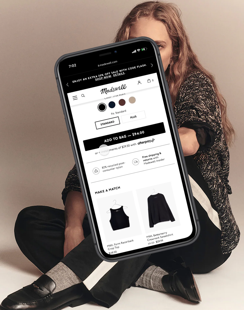
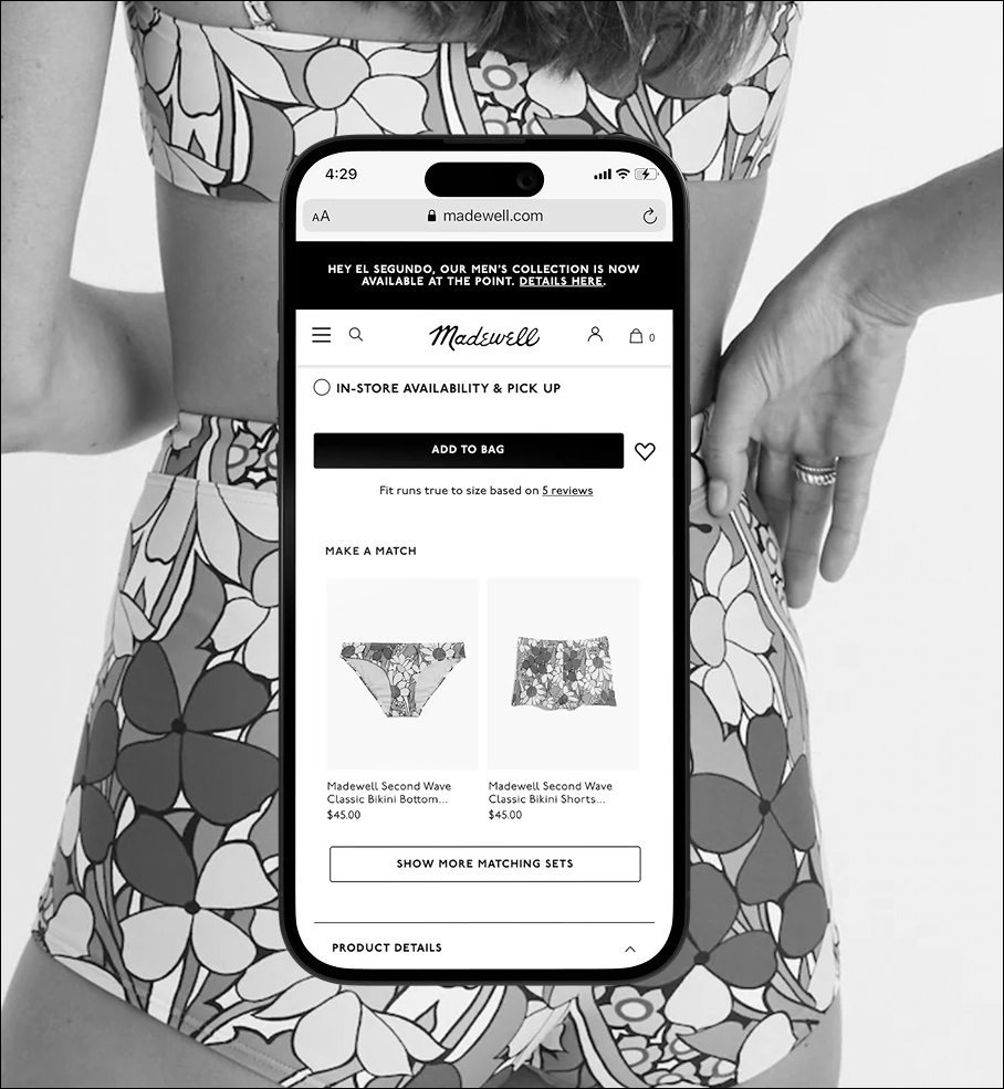
Madewell invested heavily in matching sets for Spring 2022, but the product experience wasn’t built for coordinating pieces. Customers could see matching items while browsing categories, but had to navigate between multiple pages to buy a full set. If entering from search or ads, the matching piece was invisible altogether. This project was about making multiple matching pieces visible and easy to purchase within the constraints of a legacy system.
Early explorations prioritized speed: enabling fast add-to-cart without leaving the product page.This approach minimized additional page real estate. As the design matured, it became clear that supporting quick-add cleanly would require reworking cart-confirmation behavior, expanding scope beyond the original timeline.
I pivoted to a streamlined design: simple product tiles for matching pieces, testing placement above and below product details. This required minimal new development and aligned with actual user behavior. Early results showed +$4.56 revenue per visitor, compared to the product recommendation zone average of $1.83. The work demonstrated how testing assumptions early—even informally—can prevent overbuilding and lead to simpler, more effective solutions.