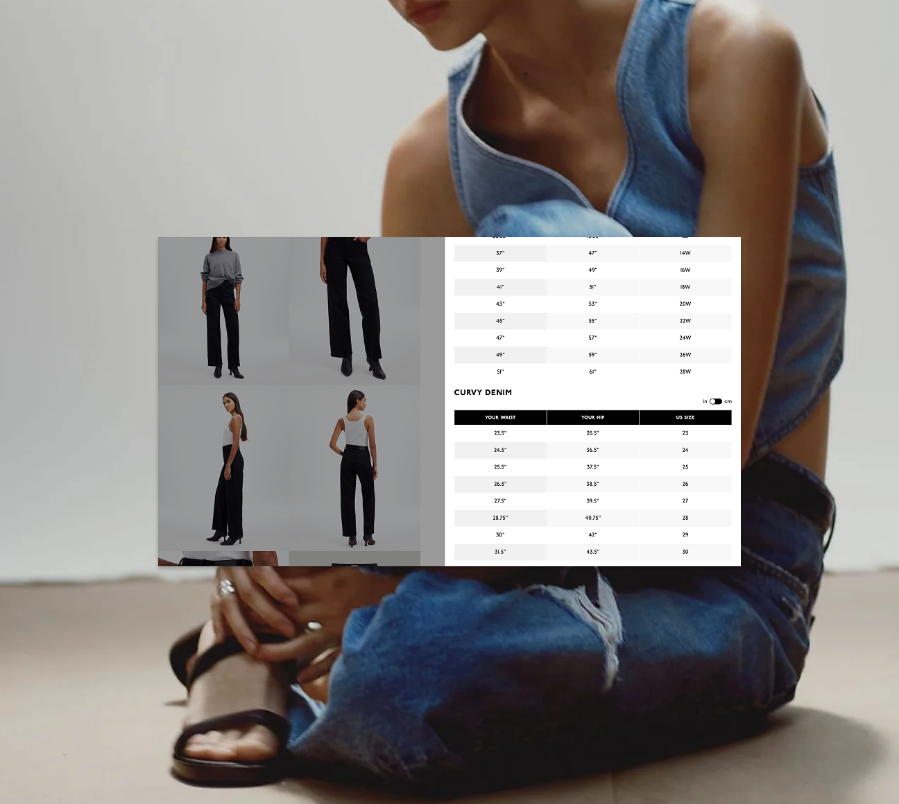
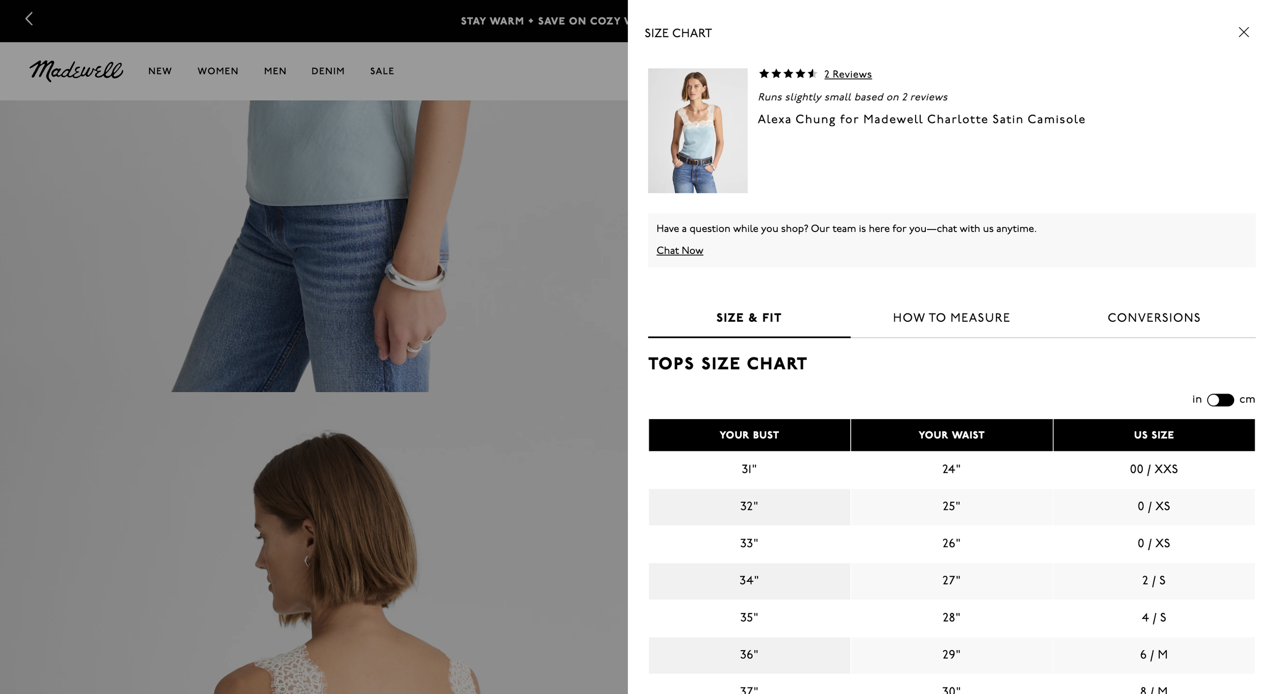
solo UX DESIGNer (2021)Madewell size charts
Madewell's size charts were outdated, visually inconsistent with the current brand, and contained multiple errors. Return rates for denim were notably high, suggesting customers struggled to find their correct size. As the company prepared to launch an extended size range, the size chart system needed to accommodate the expanded offering while creating an experience that felt welcoming to new customers.
What started as a visual refresh became a cross-functional effort with the technical design team to audit and correct sizing data. Research with customers in extended sizes revealed that many had negative experiences with retail sizing—being directed to separate sections or unable to find their size. I conducted guerrilla testing over two weeks to validate our approach and inform design decisions: I redesigned the "how to measure" diagram to show a range of body types with inclusive measurement instructions, advocated for combining size ranges to avoid separation (flagging technical limitations that later proved significant), and worked to ensure the experience felt seamless. As part of a broader product page redesign, I made size charts more prominent and accessible.
The redesigned size charts and improved visibility contributed approximately $25M in incremental revenue annually by helping customers find their correct size and reducing returns. The research-led approach demonstrated how understanding customer pain points can drive outsized business impact.