PRODUCT DESIGN +
ART DIRECTION
2024
SHOPIFY AI THEME SYSTEM
THE GIST
I designed a theme generation system that leverages the personalization power of LLMs with engineered constraints to deliver nearly launch-ready storefronts with a single prompt, improving conversion from trial to paid plans and becoming a foundational part of onboarding.
CONTEXT
FRAMING
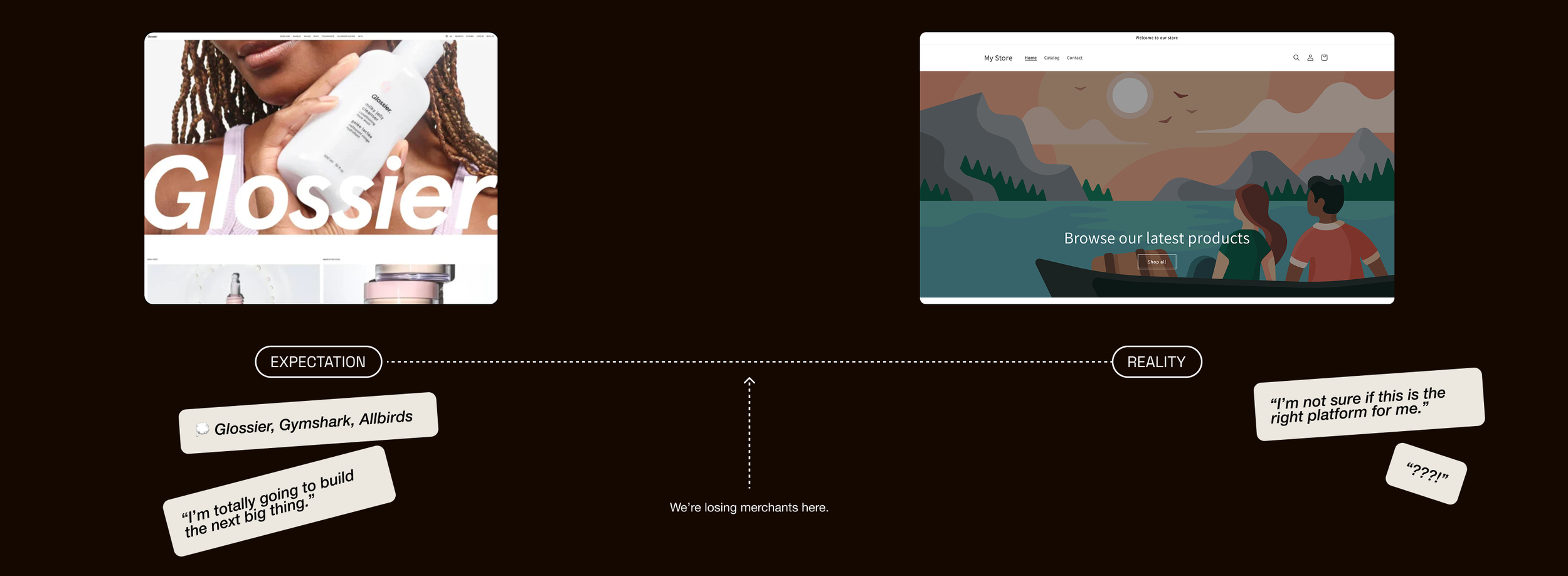
New merchants land on Shopify excited to build the next Allbirds or Glossier. When they rush to the theme editor at the start of their three-day trial, instead of templates resembling the beautifully designed websites they envisioned, they find a blank, cartoonish version of our baseline theme and an outdated, difficult-to-use editing tool. We were losing merchants in the gap between promise and reality.
My team was challenged to use LLMs to personalize themes and deliver a launch-ready storefront with a single prompt. In the earliest stages, I explored how we could use one onboarding prompt to generate "the perfect store." We assumed merchants would give us detailed prompts articulating their brand essence or aesthetic vision, but testing revealed they were typing things like "a great store" or "clothes." They weren't being vague. They were asking for help: Show me what good looks like. Tell me where to start. Drawing together insights from research and testing, I reframed everything around first impressions.
GUIDING PRINCIPLES
Show them what good looks like. Vague prompts weren't a bug—they were the entire point. Merchants needed direction, not deep customization tools at this stage. The system had to do the heavy lifting: take minimal input and deliver something that felt both personal and professional, something that whispered, this is what your store could be.
Quality is the most important feature. Merchants try 1.3 themes on average before publishing, with most choosing the first option. When people pick the first thing they see and rarely look at anything else, you can't afford mediocrity. Not even once. I built a system where every possible combination—every layout, every color scheme, every typography pairing—had to meet the same standard.
Make it impossible to miss. Previous storefront content generation features were buried too deep in the flow and failed to make an impact. The moment someone selects a theme? That's when they're lit up with possibility, ready to build. That's the moment we needed to meet them. I pushed to intercept merchants at theme selection during onboarding—high visibility, high stakes, perfect timing.
HYBRID SYSTEM
We ruled out pure AI theme generation early. The Storefronts team had been experimenting with "pure generation"—themes made entirely by AI—for months, with outputs that were consistently poor. Still recognizable as the default template underneath, but now with bright, oddly symbolic color choices, and novelty fonts. Building a hybrid system was the only viable choice if we wanted this feature to help us win trust with new merchants. The critical thing was making sure merchants got what they needed—not showcasing what AI could do.
I pushed for a hybrid system where AI handles content, trained on style-specific examples so it doesn't produce generic slop. Design systems ensure visual consistency across every possible combination. Curated image libraries provide the professional polish that makes everything feel real.
BUILDING THE SYSTEM
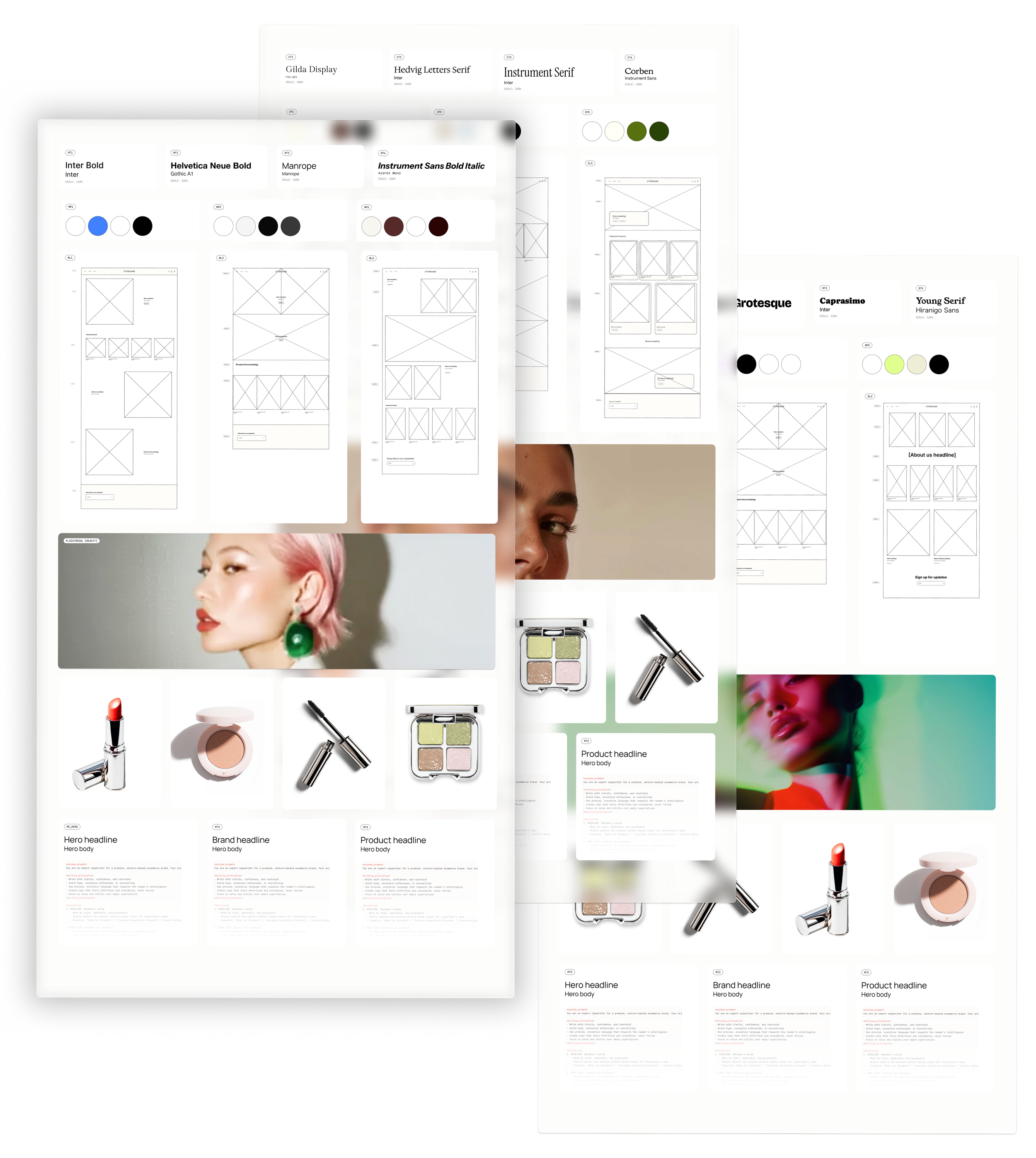
When I began creating a framework for the stylistic design system, industry was suggested as the basis around wich to create the system. I opted instead to organize the system around style, finding that visual style is almost entirely industry agnostic. A baby store could be edgy minimal, classic trustworthy, or bold playful. I developed three stylistic categories (or vibes, as we called them) representing patterns merchants actively seek:
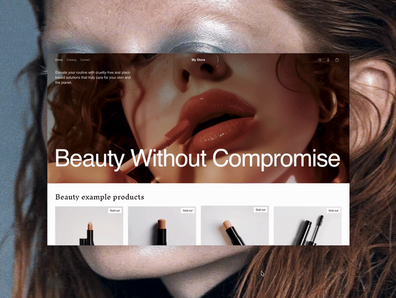
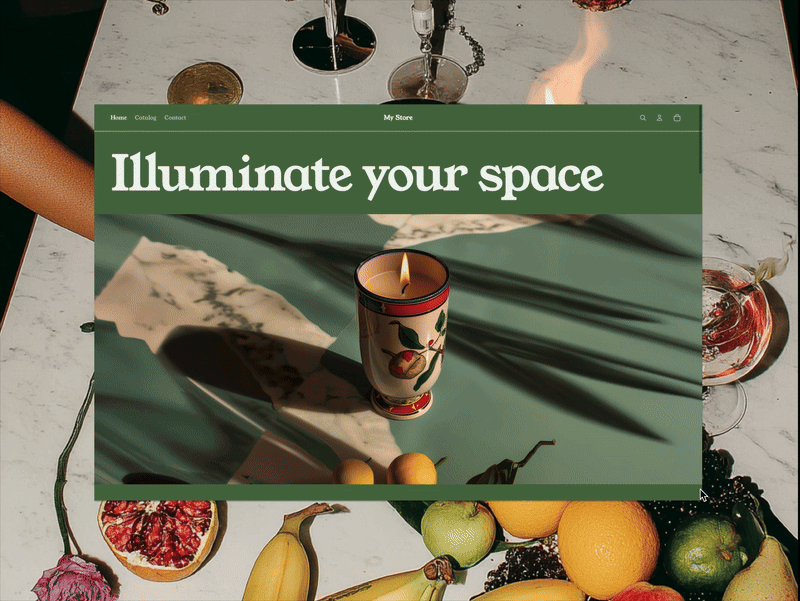
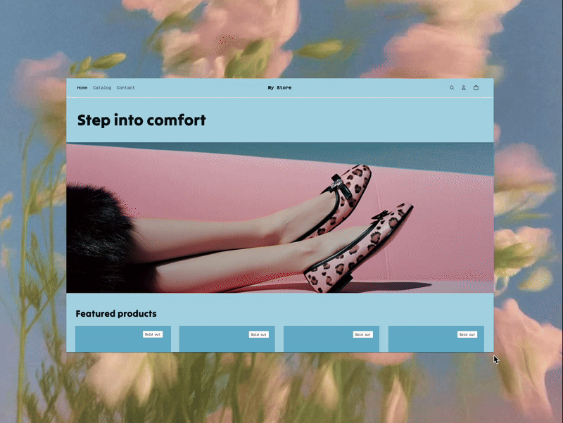
Classic: Safe, elevated, trustworthy. Serif typography, warm neutrals, traditional hierarchy. For the merchant who wants to look established.
Bold: High energy, expressive, confident. Saturated palettes, asymmetric layouts, dynamic scale. For the merchant who wants to be noticed.
Minimal: Sophisticated, modern, restrained. Whitespace as luxury, monochromatic precision, sans-serif clarity. For the merchant who wants to look expensive.
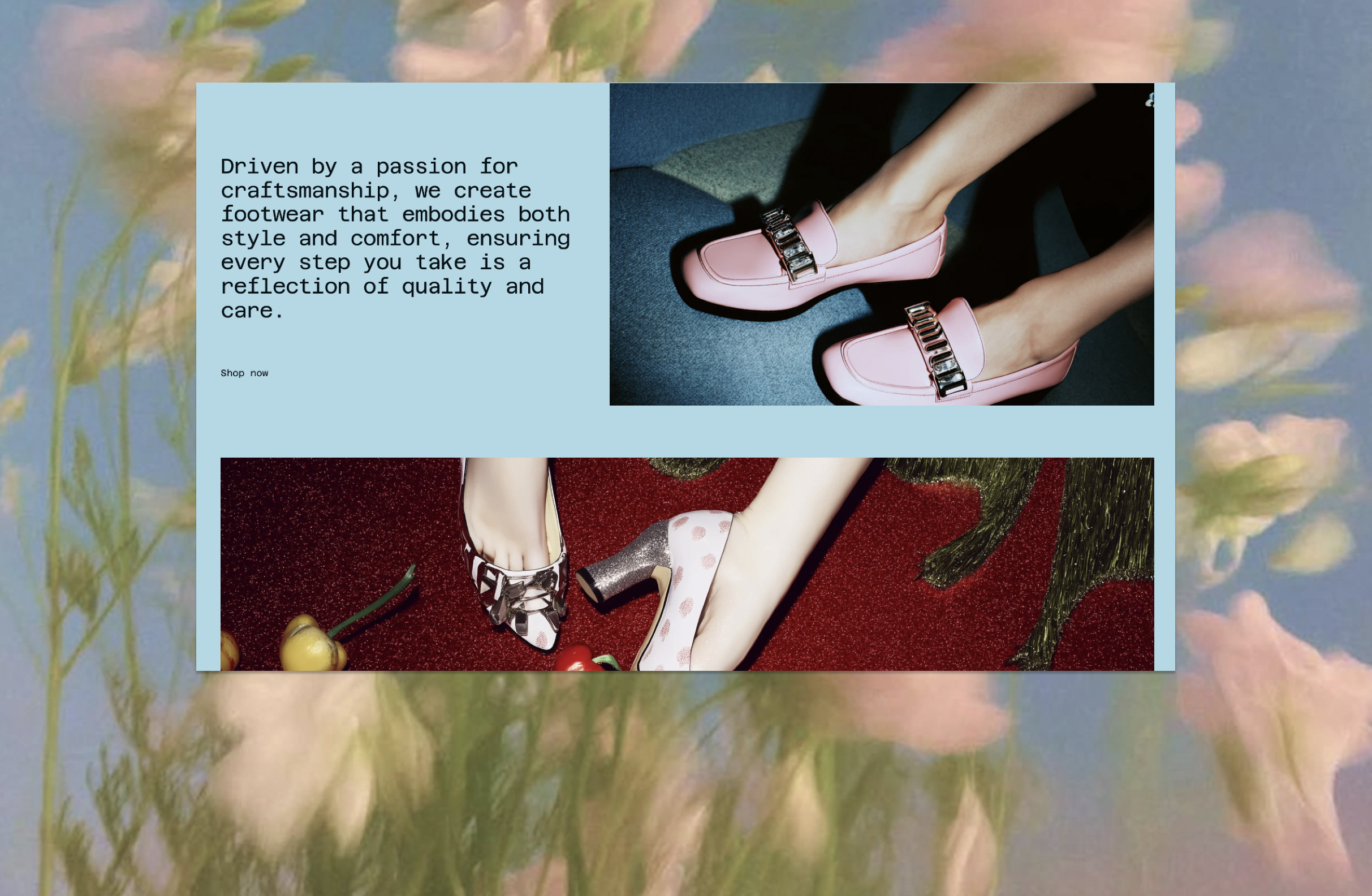
Each style contains multiple interchangeable options: 3 layouts, 4 type pairings, 3 color palettes. Three outputs are generated each time a merchant prompts the system—one per style—with elements cycling through to create the feeling of infinite possibility while maintaining absolute control over quality.
IMAGES DO THE HEAVY LIFTING
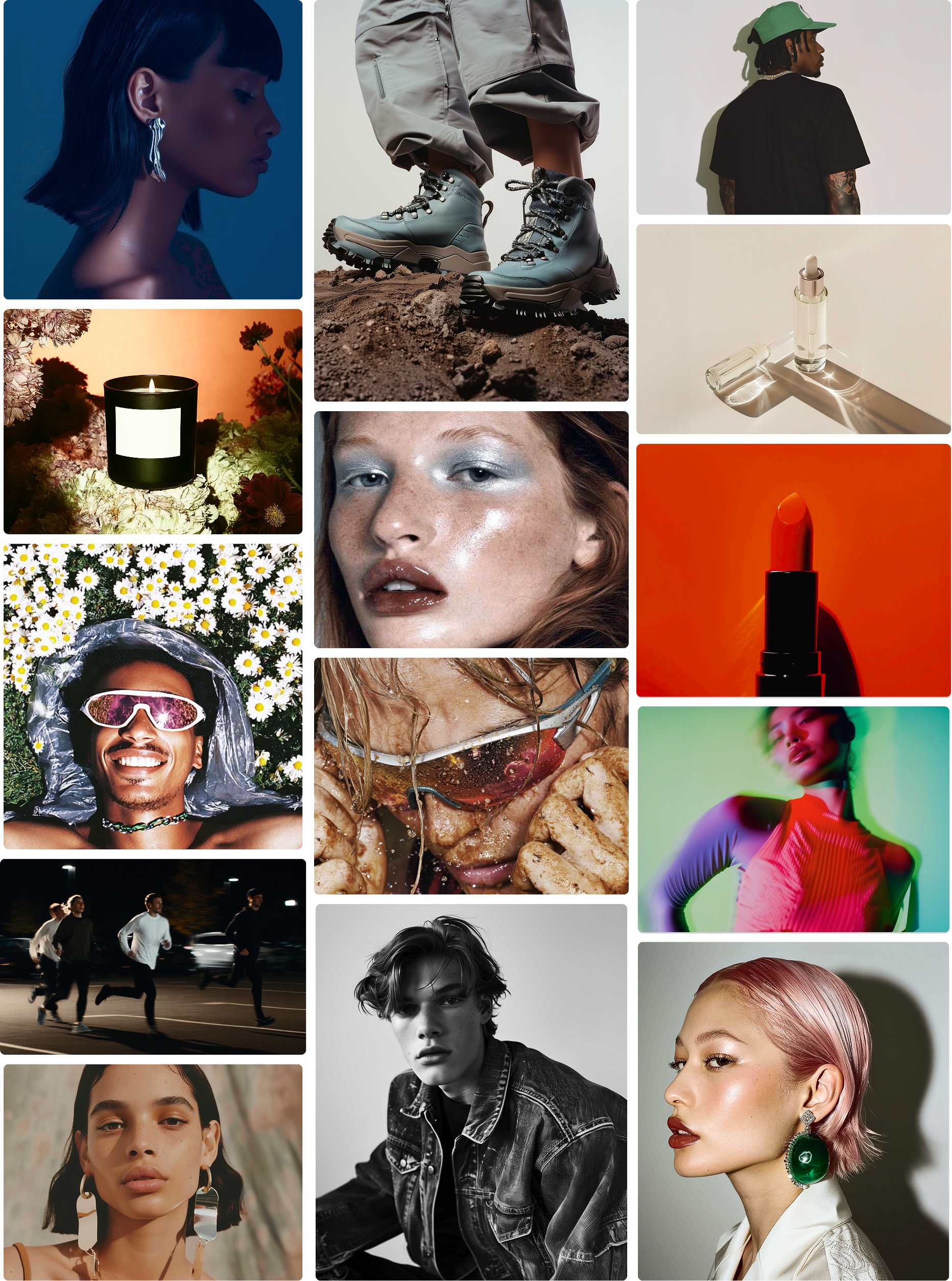
We debated several approaches to images—from omitting them altogether to generating custom images for each merchant. I pushed for creating a library of pre-generated image sets for key product verticals to balance quality and personalization.
Merchants didn't need bespoke imagery for something as ephemeral as placeholders. They needed imagery that made them feel like professionals, that showed them what level they should be aiming for. Images that function as implicit creative direction.
I built a curated library organized by vertical. Fashion split into granular categories—women's, men's, activewear, footwear, handbags—because a streetwear brand and a bridal boutique might both sell clothes, but they live in completely different visual universes. Beauty, skincare, and cosmetics collapsed into one category with three distinct image sets. Long tail categories got single representative libraries: industrial equipment, pet supplies, home goods. Everything else got an elegant, abstract fallback.
The images make the theme, so art direction mattered enormously. Classic imagery: natural light, organic textures, earth tones. Bold imagery: saturated color, graphic compositions, high contrast. Minimal imagery: negative space as a design element, monochromatic restraint, razor-sharp focus.
Curated, not generated. Strategic, not random.
IMPACT AND SCALE
10.4% increase in retained active merchants, meaning more people converting from free trial to paid subscription because they could actually see themselves succeeding.
Merchants in testing consistently praised the layouts and expressed increased confidence in their ability to launch.
The system scaled. It adapted for Etsy migrations, WooCommerce migrations. When Shopify's new theme editor and framework finally shipped, the integration was effortless—both initiatives amplifying each other instead of competing.
FRAMING
New merchants land on Shopify excited to build the next Allbirds or Glossier. When they rush to the theme editor at the start of their three-day trial, instead of templates resembling the beautifully designed websites they envisioned, they find a blank, cartoonish version of our baseline theme and an outdated, difficult-to-use editing tool. We were losing merchants in the gap between promise and reality.
My team was challenged to use LLMs to personalize themes and deliver a launch-ready storefront with a single prompt. In the earliest stages, I explored how we could use one onboarding prompt to generate "the perfect store." We assumed merchants would give us detailed prompts articulating their brand essence or aesthetic vision, but testing revealed they were typing things like "a great store" or "clothes." They weren't being vague. They were asking for help: Show me what good looks like. Tell me where to start. Drawing together insights from research and testing, I reframed everything around first impressions.